VANTA.
LESS, BUT BETTER.
A men’s personal-care concept built around elevated everyday essentials — quiet, premium and intentionally restrained. The system carries one clear visual language across identity, packaging, product photography, e-commerce and launch communications.
Quiet confidence, built into the system.
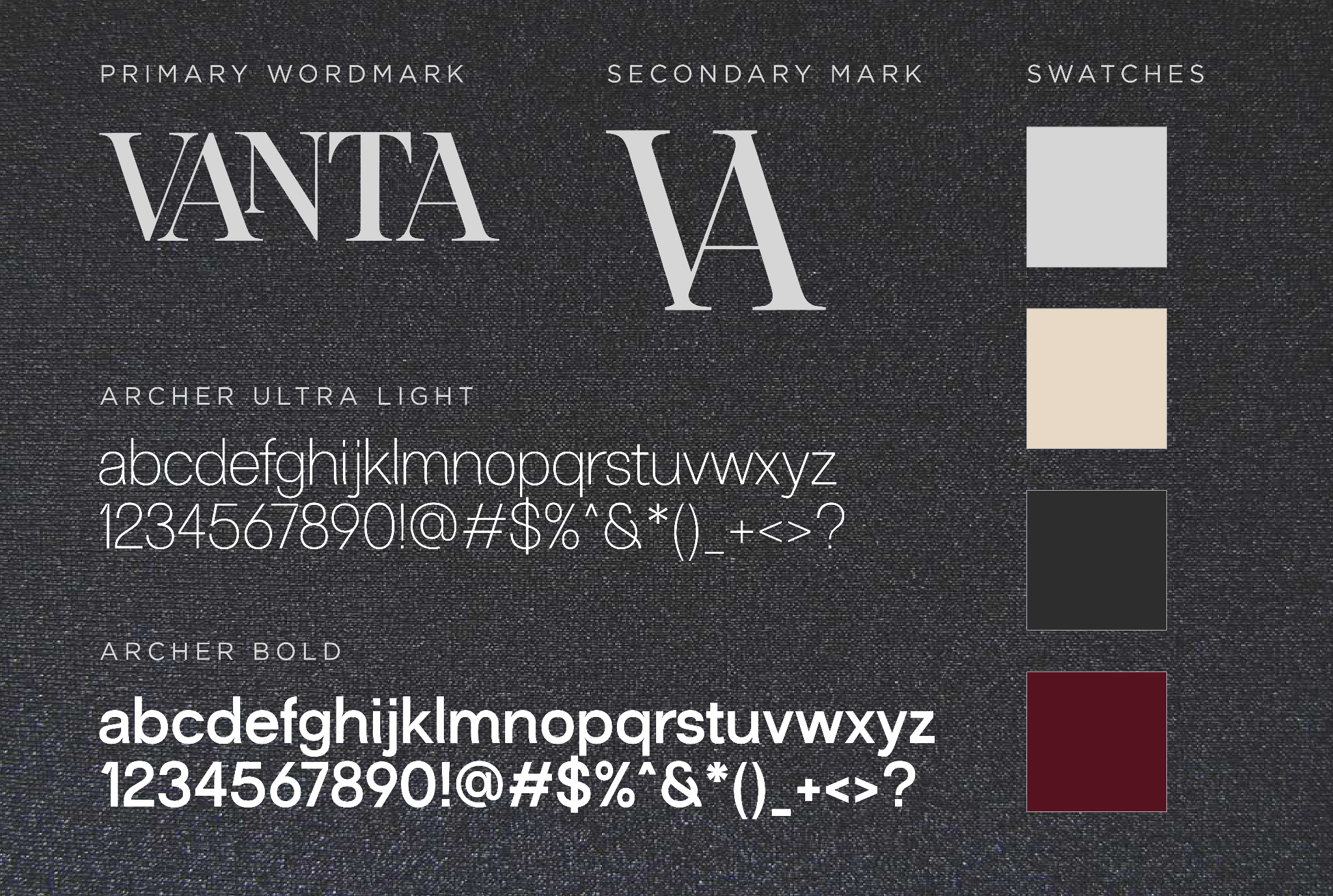
VANTA avoids the exaggerated visual language often used in men’s grooming. A high-contrast editorial wordmark, restrained sans-serif typography and a palette of warm ivory, charcoal and deep burgundy create a brand that feels masculine without becoming loud or performative.
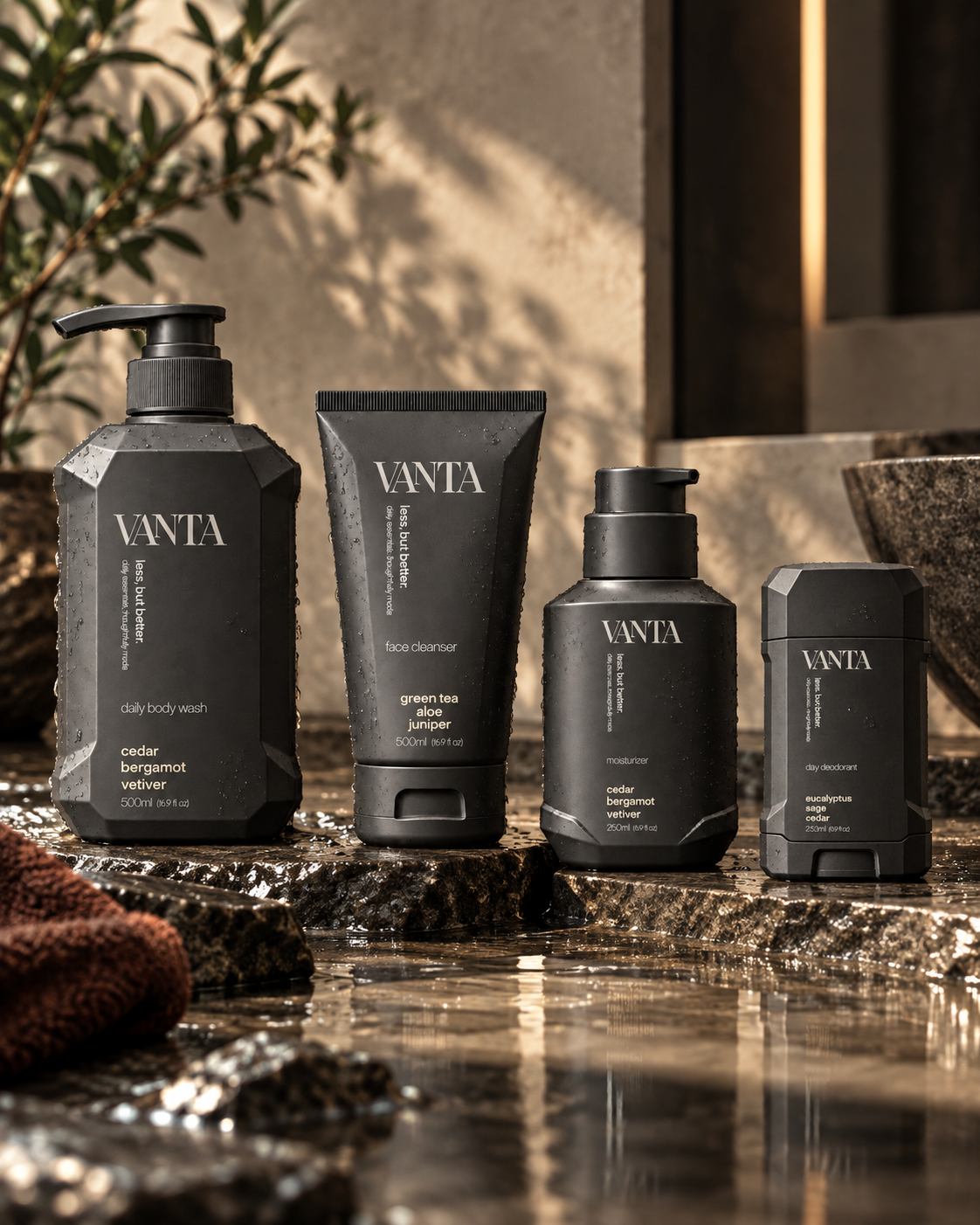
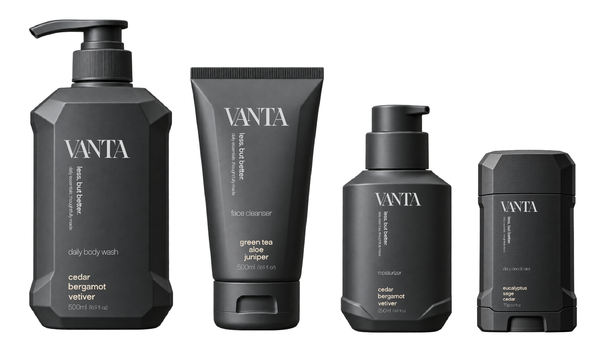
Four essentials. One recognizable family.
The packaging system uses matte charcoal containers, architectural faceting and a consistent typographic hierarchy. Each product has its own silhouette while the wordmark, vertical message and ingredient structure keep the collection visually connected.
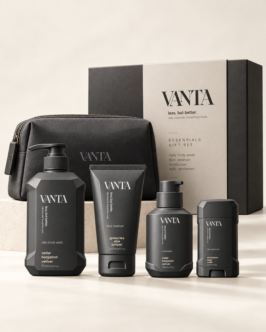
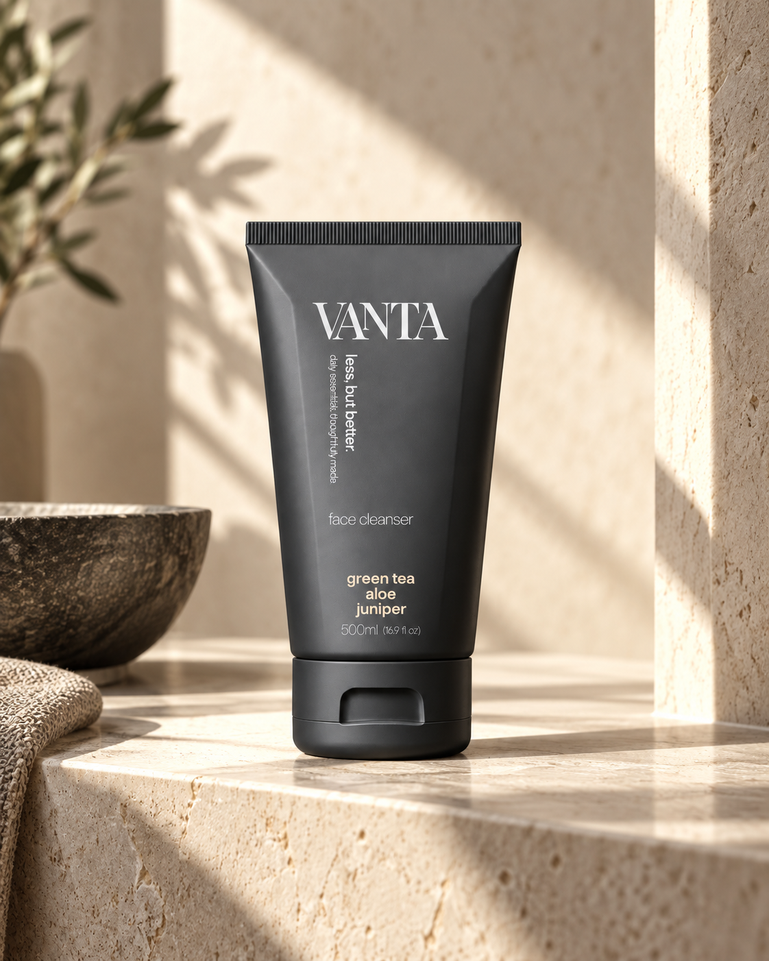
Let the product and the space do the talking.
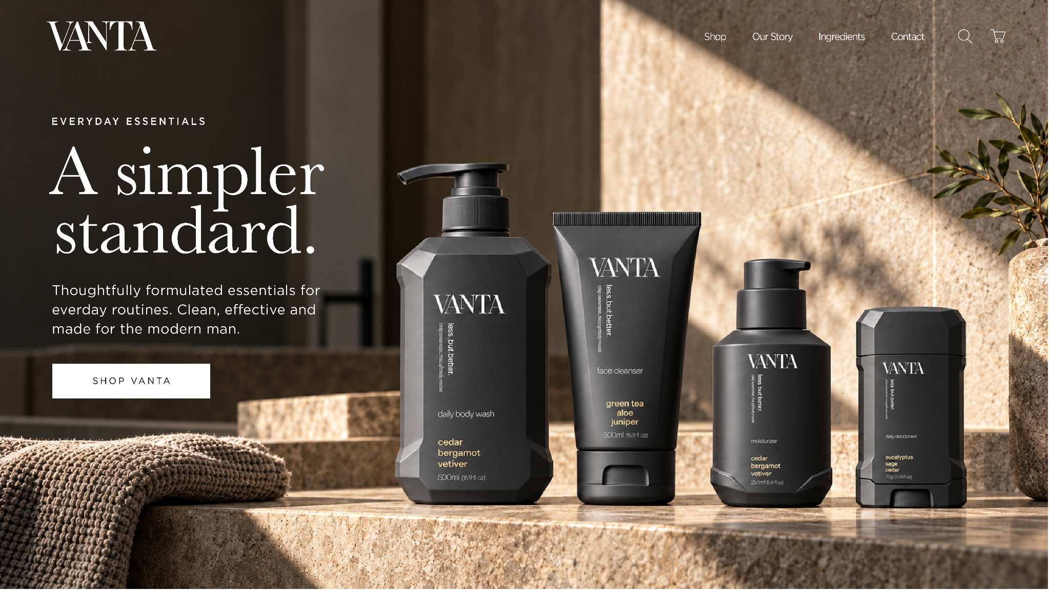
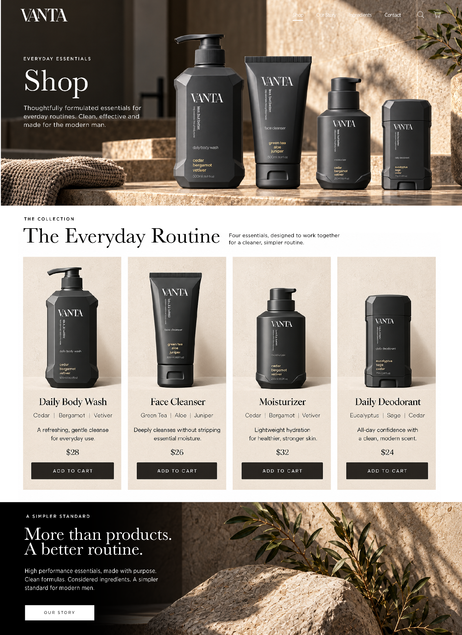
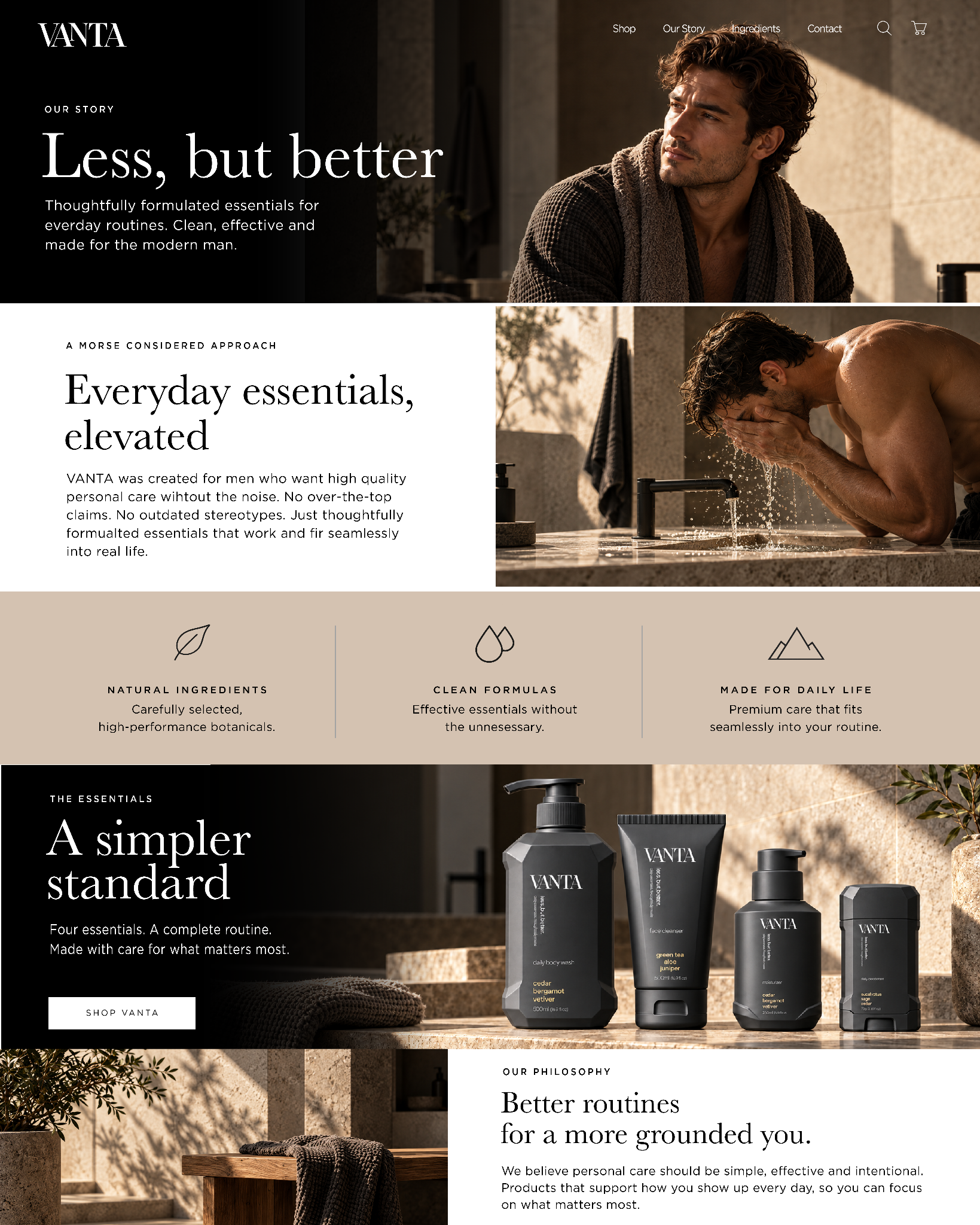
The digital direction uses generous negative space, warm stone environments and restrained typography to keep the experience premium and product-led. The system extends from the homepage into the shop and brand-story experience without changing tone.
Launch without adding noise.
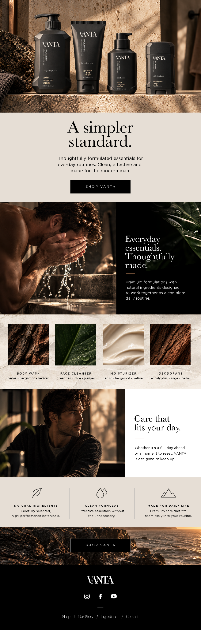
The launch email translates the same editorial system into a long-form campaign touchpoint: product-first imagery, short copy, tactile ingredient details and a clear path into the collection.
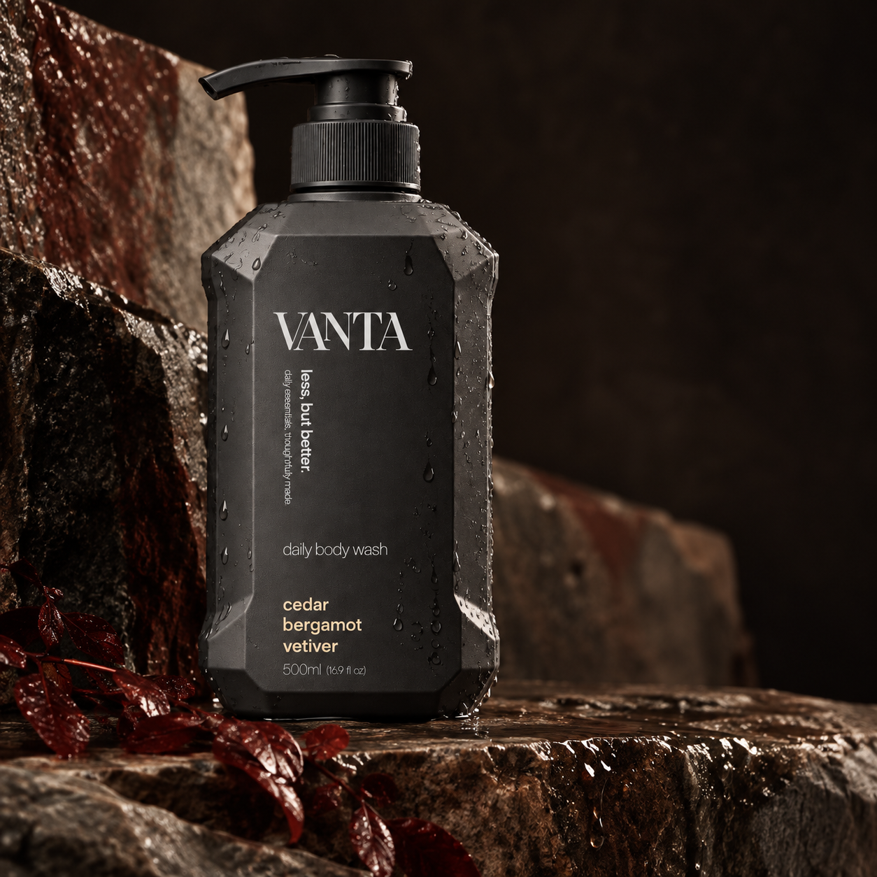
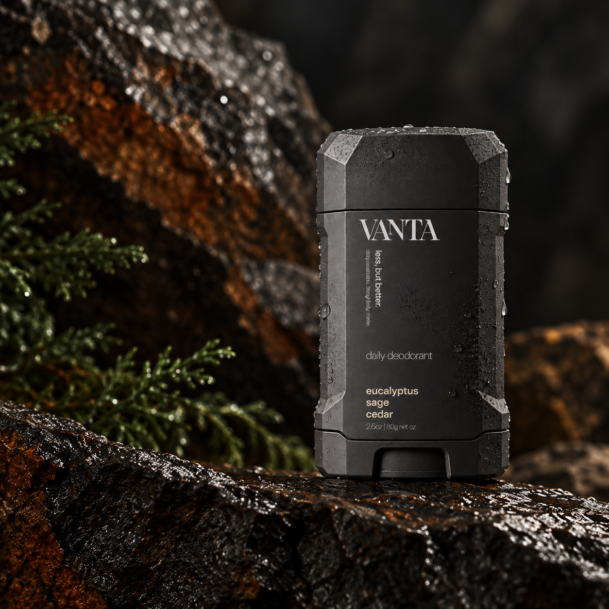
Natural materials. Dramatic light. No unnecessary noise.
The campaign photography builds a tactile world around the packaging using wet stone, warm directional light, botanical cues and deep shadow. The result is rugged enough to feel masculine, but still controlled, refined and consistent with the brand’s quieter point of view.